Order with Rx Design Problem
This was another project I made in summer 2018 at 1mg, Gurgaon, working as a Proouct design intern. My problem statement was to redesign the experience of the user buying medicine from 1mg with doctor's prescription. I worked Under senior designer and we went exploring the problem and interacting with different stakeholders.
Different data sets were given where drop off was seen by a product manager. A hypothesis was taken where the users may encounter problem. Stakeholders provided us the data where customer drop off was maximum and then we conducted in-depth research identifying customers mindset, trigger points, expectations, affordability, and rewards. To make sense of the gathered data user research was a major requirement. To understand customer needs and get useful insights we looked into the data of uploaded prescription.
Timeline(4 weeks)
Finding Target Audience
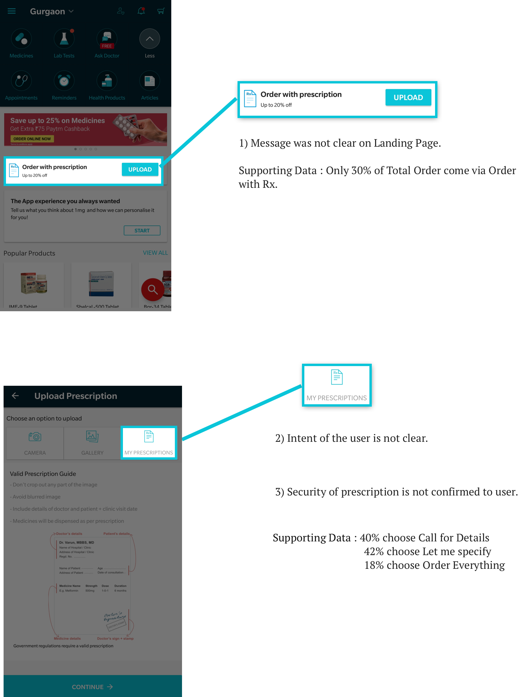
Order with Rx is a quick buy mode for the users who upload prescription and want to add info to their order. If you open 1 mg app you find a text saying “Order with prescription” or “upload prescription” you can explore this feature from there. For buying medicine users can either search or browse medicine/otcs or upload their prescription directly. So according to this users can be defined in two categories.
We found that our main target audience were -
- Caregivers
- Non-Tech savy
- Housewife
- Old age people
- Chronic
- Acute
- Tier 2-3
Defining the problems users were facing
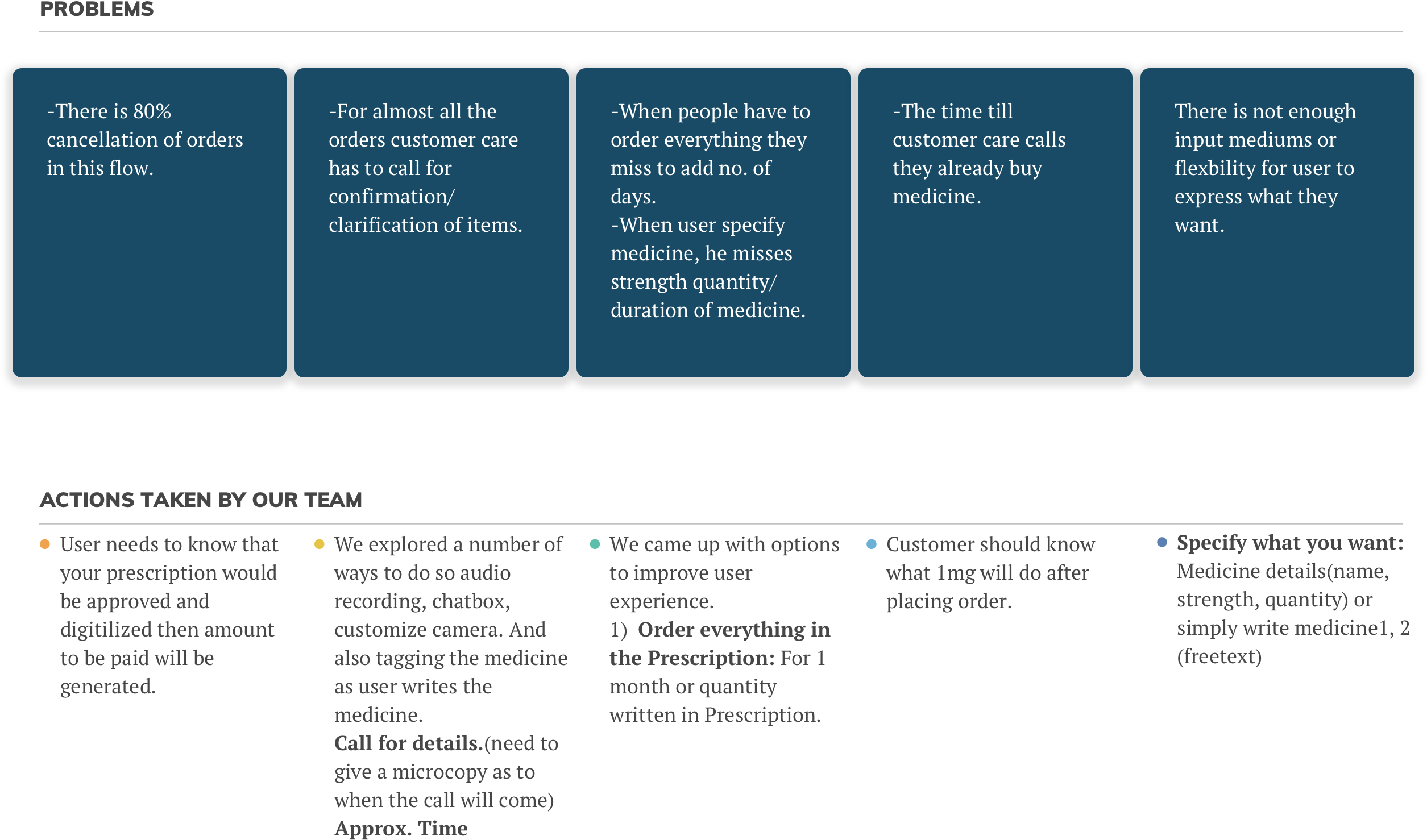
The data provided by different stakeholders was analysed and the drop off of our customer was noticed according to which these problems identified. Solving these problems in the app can improve user experience of the app.
Screens
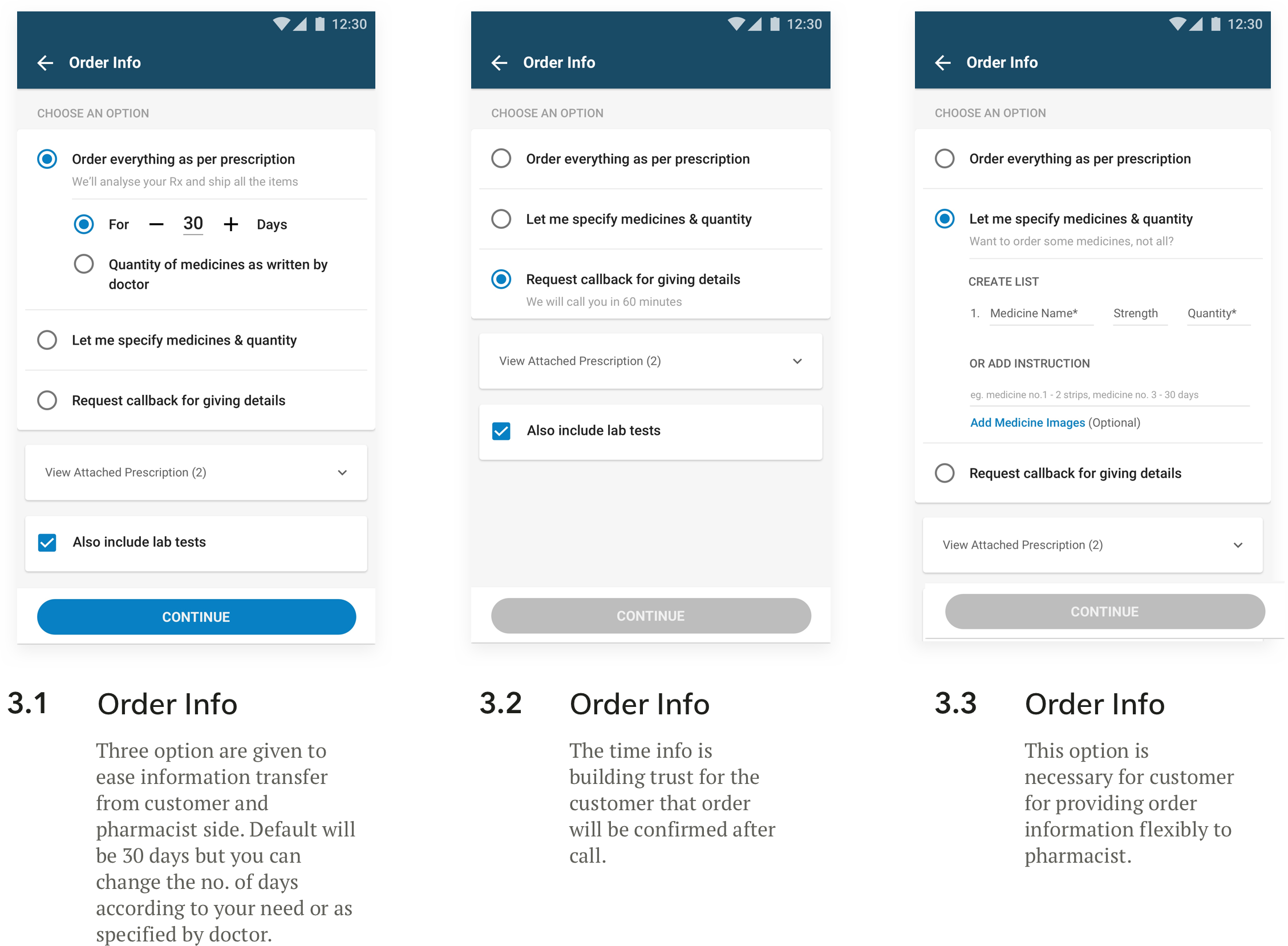
The next step involved coming up with multiple iterations of mockups and working prototypes. I used 1mg design language with an improvement over User Experience. After 2-3 rounds of user testing, we came up with a better design solution. Here we specifically focused on content and number of clickable options in one screen. And later we had to increase one screen of payment to remove the basic confusion that most users were facing “that their order is placed and payment will be done when the order will be confirmed from pharmacist”.
Summarizing
By doing this project I came to know how a product feature is designed according to customer’s need. My learnings include-
- No. of clicks needs to be minimum to reduce the motor load in an e-commerce app/website.
- They should be provided with feedback on the progress status at every point.
- The implementation model should be as close as it can be to the mental model.
- A feature can be useless if not implemented in the way customer understands and uses it.
- Product design is a regular iterative process you need to take feedbacks from data regularly to make the product feasible and functional.


